Shabby Blogs Background

Showing posts with label layout. Show all posts

Thursday, August 16, 2012

Using Fabric on Your Cards and Layouts

Hi there! If you've jumped over here from the Practical Scrappers blog then Welcome! I'm so happy to see you!! Today I am talking about using fabric on your projects and I'm sharing a number of ways in which I have done just that recently.


Fabric is a pretty hot trend in the paper crafting world right now and there are many types of fabric you can add to your cards and layouts. Some have been around for ages - think ribbon and lace - and some are fairly new - fabric paper for example. Today I want to show you how to take ordinary pieces of cotton fabric and transform them!

First let's make some embellishments out of fabric like I did here on these two cards.


Both these flowers were made using a piece of cotton fabric and a sheet of Multipurpose Adhesive for the Big Shot. Let me show you how I made them.

1. This is the Big Shot Multipurpose Adhesive Sheet as sold by Stampin' Up (see below for links). It comes 12 sheets to a pack and each sheet is 12"x12" so you can make TONS of projects from one pack. And they're not just for fabric, that's just what I'm showing you today. In fact, Stampin' Up also sells adhesive rolls specifically for fabric but since the Multipurpose sheets are great for paper too, I think they are a better deal for layout makers like myself.

2. Lay your fabric on your work surface face down (TIP: iron it first!! learned the hard way that those creases don't magically come out when you lay the adhesive sheet on top of them!) Peel off one corner of the adhesive sheet, turn it over and stick it down onto your fabric.

3. Slowly pull back the rest of the adhesive backing using a bone folder to keep it as straight and crease free as possible until the entire 12"x12" sheet is adhered to your fabric.

4. Trim off the excess and then use your bone folder again (or a credit card or ruler if you don't have a bone folder) to get out any remaining creases or air bubbles. And no, I was not able to get out that huge crease but as I was cutting the sheet in half to fit through my Big Shot I decided not to worry about it. Remember, IRON FIRST!

5. Cut your sheet to fit your Big Shot die - I used the Fun Flowers Bigz L die so a simple cut in half sufficed. If your die is smaller you may want to cut your sheet smaller to minimize waste. Make your Big Shot sandwich (cutting mat - Die - fabric - cutting mat) and run everything through your Big Shot (or other manual cutting system - whatever you have.) 

5b. I found that some of my flowers didn't cut completely through, so when I ran my second piece of fabric through I used a scrap piece of card stock as a shim and the flowers cut out perfectly. In this picture you see the white card stock shim on top of the Big Shot sandwich - this is very important. If you put it under the top cutting mat you will just end up cutting out white card stock flowers as well as fabric ones. Maybe that's what you want ... maybe it's not!

6. Sit back admire your beautiful fabric flowers! :) I cut out two full sets plus a couple extra of the larger flowers to have on hand.

7. Time to assemble your card. Obviously, you would use whatever papers coordinated with your fabric, I am lucky enough to get to work with Stampin' Up papers and fabrics which are already pre-coordinated. So here I am showing you a piece of Riding Hood Red card stock (5.5" x 4.25" folded in half) and two pieces of the Twitterpated Designer Series paper which coordinate with that pink Twitterpated Designer Fabric.

8. I love to ink my edges. I find it gives added definition and "finish" to my projects. Here I am showing you how I do that using a Stamping Sponge that I've simply cut into a wedge shape. I am using Soft Suede ink - my favourite colour for inked edges!

9. Don't forget about your fabric flowers. They gain a lot by having their edges inked too!

10. For our first card I simply adhered my paper pieces as shown using my Snail Adhesive runner. Then it was time to start building my fabric flower embellishment. Carefully peel the backing from the largest die cut flower and adhere it to the card as shown below.

11. Continue this with the smaller flowers laying them down in a offset pattern being sure to keep them centred.

12. Finishing touches. I finished my card off with a button tied with some bakers twine and a sentiment stamped onto a piece of Whisper White card stock. Here is a close up of the finished flower.


13. For a more 3-dimensional flower like this one, I simply left the backings on each flower layer and used my bone folder to curl them after they were adhered together. With the addition of a Vintage Faceted Button, it looks like this on the finished card.

Well, that's one way to use fabric on your cards and layouts ... are you still with me? Want another way?
How about using it in place of paper? That's right, you heard me. Instead of pieces of patterned paper on this layout, I used pieces of fabric.


There are literally 3 pieces of paper on this whole layout (okay, 5 if you count the photos!) - the background card stock and the two pinked circles under the rolled fabric flowers. Everything else is fabric!

The large square of brown fabric was adhered using another Multipurpose Adhesive Sheet and the smaller pieces were adhered using Sticky Tape. (If I had a functional sewing machine I would have sewn them to the card stock but ... I don't, so tape and glue are my friends!)


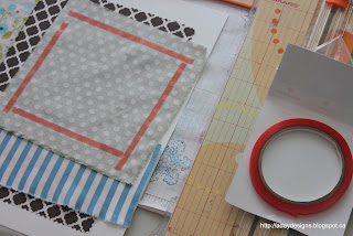
This is what my layout's starting point looked like.

Here a close up of the layers of fabric. Oh yeah, I also wrote my journaling right onto the fabric! Easy peasy!!


And now for my third way to use fabric on a layout or card - make a rolled flower embellishment like this one.


Here's how I did it.

1. Start with a giant glue dot - take off the top layer of plastic to expose the glue.

2. Twist your fabric and place one end in the middle of the glue dot.

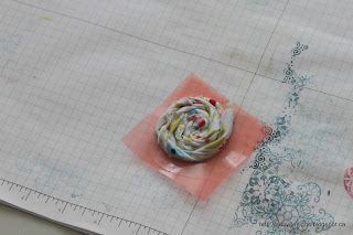
3. Keep twisting your fabric as you roll it around and around from the centre out until you are left with something that looks like this. The longer and thicker your piece of fabric the bigger and fuller your finished flower. I punched out a 2.5" circle of white card stock and used my pinking shears to pink the edges. Once it was mounted onto this I added a button and called it done! 

I used smaller scraps of the brown fabric to make another flower - here's a close up of that one.
The strips were narrower and shorter so the flower is looser and smaller than the other one on the page.  

One last way to use fabric on your layouts ... as trim like I did to anchor the photo on this layout.

Yes, that is yet another variety of fabric flower but this post is already reaching epic proportions so I think we'll save that for another time. 

Thanks for joining me today as we explored my second favourite thing to stock pile ... FABRIC! As always, please leave a comment sharing ways in which you've used fabric and I'll be sure to pop over and check it out. 

Here are your links for products featured in today's post:

Saturday, August 4, 2012

Using Some Twelve Inspiration

I have been participating  (or trying to anyway) in Stacey Julian's Twelve class over at Big Picture Classes all year. I was really good up to about May and then I sort of fell off the wagon. I was still creating layouts (as evidenced on my blogs and galleries) but I was forgetting to use my designated Twelve embellishments (we all pulled out minimum 144 different embellishments in 12 colours and keep them stored in a muffin tin to be added one to each layout completed) and I was definitely not thinking about what I was creating or why. Anyway, I just finished the first layout of the year using a piece of Inspiration from Stacey herself. At the beginning of every month Stacey posts 12 new Triggers on the class site. They are designed to inspire us to create, think or just for our viewing enjoyment. As soon as I saw the triggers this month I jumped up to create this ...


It was inspired by this layout by Stephanie Howell.

I knew I had multiple doily stamps that I could use to recreate the look of her background paper and the doily Sizzlits dies in the catalogue would be perfect for the embellishments. I used Gossamer Lace, Lacy & Lovely and Artistic Etchings in Craft White on Crumb Cake (the Amour stamp is also from Artistic Etchings and is in Crumb Cake ink) to create my background image. 

We used accents of purple at our wedding so I looked for some purple patterned paper and found this one in International Bazaar. I knew that I wanted a different title work than my alphabet stamps or my alphabet dies could give me so I had to turn to my non-Stampin' Up stash for some glittery AC Thickers. 

I cut out several different doilies using the Delicate Doilies and Paper Doily Sizzlits. I cut them out in both Whisper White and Vellum intending the layer them. In this picture you can see the large Paper Doily with a smaller doily from the Delicate Doilies both tucked behind the picture block. The purple ribbon is also not from Stampin' Up - it's actually leftover from creating our wedding invitations! I accented the bow with one of the Vintage Faceted Designer buttons. The yellow heart behind is punched from Echo Parts Dots and Stripes and is my Twelve embellishment indicating that this layout was based on some sort of Inspiration. (Yellow is my Inspiration colour.)

I tucked my journalling behind my picture on a little tag I created from a leftover scrap of Whisper White card stock. 

Here's what that tag looks like.

Last but not least is the embellishment cluster behind the title. One of the smaller doilies from Delicate Doilies in Whisper White  with a couple vellum ones over top. Another couple Vintage Faceted buttons, some more ribbon to ground everything and a little hand written label that adds a bit to the title.

I am really pleased with this layout. I haven't scrapped any of my wedding pictures yet and now kind of feel inspired ... we'll see! I will for sure be creating more customized background papers though!

Thanks for stopping by today. I'd love for you to become a follower and leave a comment telling me if you've ever created your own background papers before.  Here are your links to Stampin' Up! supplies featured in this layout.


Tuesday, July 31, 2012

Project 12 for June 2012

I'm back with another layout for my Project 12 album. July is almost finished which led me to start thinking about this project, which then led to realize I'd neglected to do my June 2012 layout. Using another sketch from Pagemaps and the Patio Party DSP collection I came up with this.


This is the sketch I used from June's Pagemaps.

Here's a close up of the left hand page. 

And the right hand page. 

As you can see I stamped a tone on tone border on 3 sides of the layout using Flowering Flourishes. I embellished some of the flowers with rhinestones - the last thing I did to finish off this layout!
Again I have used WAY more photos than the sketch called for but to keep them from overwhelming the layout I created a grid pattern and mounted them all onto Whisper White card stock. This left me with just enough journaling space for what I had to say!

Some more close ups for you .. starting with the title.

This technique should be pretty familiar to you all by now. I cut out my title using some leftover chipboard and my Typeset Alphabet die for the Big Shot. I then inked them in Baja Breeze (including inking the edges with my Baja Breeze Stampin' Write marker) and then flooded them with Cyrstal Effects.

The Patio Party DSP collection includes a sheet with lots of different patterns in strips - perfect for creating borders. I liked these banners and had originally left them uncut but felt the layout needed a bit more texture and interest. I got the idea of fussy cutting all the little banner flags out and really love the final look. It was literally a pain to do - my hand was seriously cramping by the end of it - but worth it I think!

To embellish the journaling block I played with the Reason To Smile stamp set (a special right now - see my side bar). It is a double stamp stamp set. This means you get a solid image for each flower plus the outline/detail stamp. I knew I was going to be cutting them out so I wasn't too concerned with stamping within the lines. In fact, I stamped the small blue flowers multiple time which gave them a cool layered look! Once the base colours were stamped I got out the coordinating Stampin' Write markers and added some shading and depth. I also used my blender pen to give it a more realistic look.

A closer look at the back ground stamping.

In this picture you can see the subtle texture that the solid flower stamp have.

Thanks for coming by again today. Do you document each month in any way? If so I'd love to check it out. Please leave me a link in the comments section. Hope you have a wonderful, sunny Tuesday!

Here are your links for products featured in this post.
Reason To Smile stamp set (only $5 with a purchase of $60 ENDS TODAY!)


Monday, July 30, 2012

Just for the fun of it!

The title really says it all. I wanted to play with one of the new stamp sets from the 2012-13 IBC so I just started stamping and having fun. The stamp set I was playing with was Daydream Medallions. My upline Sandra had featured a card (and this one too) on her blog using this set and it got my creative juices flowing. I wanted to use it on a layout though and here it is.


Usually when I start a layout I know what pictures I'll use but this time I started with the oddest of things ... that scalloped tulle ribbon. I'd created a card using the ribbon to make a flower and had a large piece left over that I though would look cool layered onto a layout. It's Early Espresso in colour which led me to pick the First Edition Specialty DSP, the Crumb Cake card stock base and then the Comfort Cafe DSP pieces. With the basic building blocks in place it was time to hunt for a photo. This one is incredibly blurry as it was taken with someone's cell phone but as it's the only one I have from that night, it's a keeper. 

And then it was time to start stamping.

I started by stamping the largest image onto the blue floral patterned paper in approximately where the corners of the photo would end up. But since it is barely discernible, I took the next size down image and continued stamping up into the top left corner of the layout and down into the bottom right corner. The embellishments were made by stamping more images onto different coloured card stock and using the Floral Frames Framelit dies (which are designed to fit the stamped imaged perfectly) to cut them out.

I popped up some layers using Dimensionals and added rhinestones to the centres for added bling. I also scattered some smaller rhinestones around the embellishment clusters.

I don't know if you can tell from this picture (maybe click on it to make it bigger) but I sprayed the Early Espresso card stock title letters with Vanilla Shimmer Smooch Spritz to give them some added texture.

I had a lot of fun creating this layout and can see many uses for this stamp set - both for layouts and cards! Thanks for stopping by today. Here are your links for the products featured in this post.


Daydream Medallions stamp set
Floral Frames Framelits Dies
Vanilla Shimmer Smooch Spritz
First Edition Specialty DSP
Comfort Cafe DSP
Basic Rhinestones Jewel Accents
Early Espresson 3 1/2" Scalloped Tulle Ribbon - available August 1st!

Friday, July 20, 2012

Starting Point Layout - Party Monsters

I managed to finish the latest Starting Point Layout this afternoon. If you stopped by earlier today you saw a sneak peak on this post. To see Shimelle's Starting Point post please go here. I am having so much fun with these! I think I like this idea better than a sketch. Gasp! Is that wrong? :) I have my reasons though. Sometimes I find sketches tough if I have more pictures than it shows (not surprisingly this frequently happens to me) or my title and/or journalling don't fit where the sketch suggests putting them, or my embellishments are the wrong size, etc. I know that the whole idea of a sketch is to help with the placement of design elements to make the whole process faster but to be honest, using them almost makes me scrap slower. Maybe it's the rules follower in me that feels the need to actually follow the sketch!! LOL! Whatever the reason, I find Shimelle's starting points freeing. It's like once the background is in place I am free to fit my photos, title, journalling and embellishments where ever I want. Sound crazy? Give it a try and then tell me if I'm crazy or not!!

Anyway, enough rambling. I knew I wanted to play with the new Hallowe'en DSP and when I went hunting for photos I found ones of Marley's first Hallowe'en party. I even had the exact number and sizes of photos that Shimelle had used. It was total kismet!! Here is my finished layout.


And here's a reminder of how I started.


The new papers from Stampin' Up! (Howlstooth and Scaringbone) don't have any red in it but my pictures did so I used my designer discretion to add a block of Real Red to mat the photos onto.


The title was (of course) cut out with my Big Shot using the Typeset Alphabet dies but before I did that I embossed the Tangerine Tango card stock with the new Wood Grain embossing folder. I also lightly brushed  the raised parts with Basic Grey ink.

And then I had a bit of fun. In the soon to be released Holiday Mini Catalogue is a kit to make treat bag labels. It uses a new stamp set called Googly Ghouls and comes with googly eyes. I used the spider and BOOOO images elsewhere on the layout and then came up with the idea of turning the middle of the O into a mummy using the googly eyes and some white bakers twine. Isn't he cute?

Here's a look at the spiders. Also in this picture are some large ink splotches (straight from my re-inker bottle), some smaller ink flecks (using my Aquq painter), a rhinestone that I coloured black with a Sharpie and a red and black stamped butterfly image from Papillon Potpourri. I felt I needed to bring some of that red out from behind the pictures and spread it around a bit.

Well, that's it. Thanks for stopping by. Enjoy your weekend everyone and here are your links to available products featured on this layout.